
Introduction
Working in an office environment, especially in a vibrant city like London, there is always a steady stream of data buzzwords flung around in conversations with co-workers and clients. After hearing a very specific one in my office – to the point of being sure of hearing it at least ten times a day – I decided to attempt a very simple, manually performed statistical observation. I would count the number of times a specific word was used by a specific co-worker over a span of roughly two months. The results are in, and are hereby presented in Tableau form.
The Approach
The Data Collector used a simple clicker tool to keep track of the count as soon as the buzzword in question was heard. Note that this is far from a superior way of tracking word counts, as there are a number of things that will skew the data, the most obvious being that the Data Collector must apply full attention to the co-worker word stream output. Multiple things can hinder that, including lack of attention on behalf of the Data Collector and the Data Collector or the co-worker being in different rooms/places.
In that sense, the approach is not only manual, but also highly uncontrolled. It is yet somewhat scientific, which for the purpose of getting some Tableau dashboard experience is well and good enough.
The Results
The time period started on October 5 and ended December 17, when the Data Collector grew tired of the whole thing. Christmas was also approaching and the tempo in the office decreased to the point where data collecting grew tedious. There are as such about two months’ worth of data to present. Weekends and days off (taken by either party) are, of course, not counted. The Tableau dashboard contains five charts, displaying a day by day count, totals and averages.
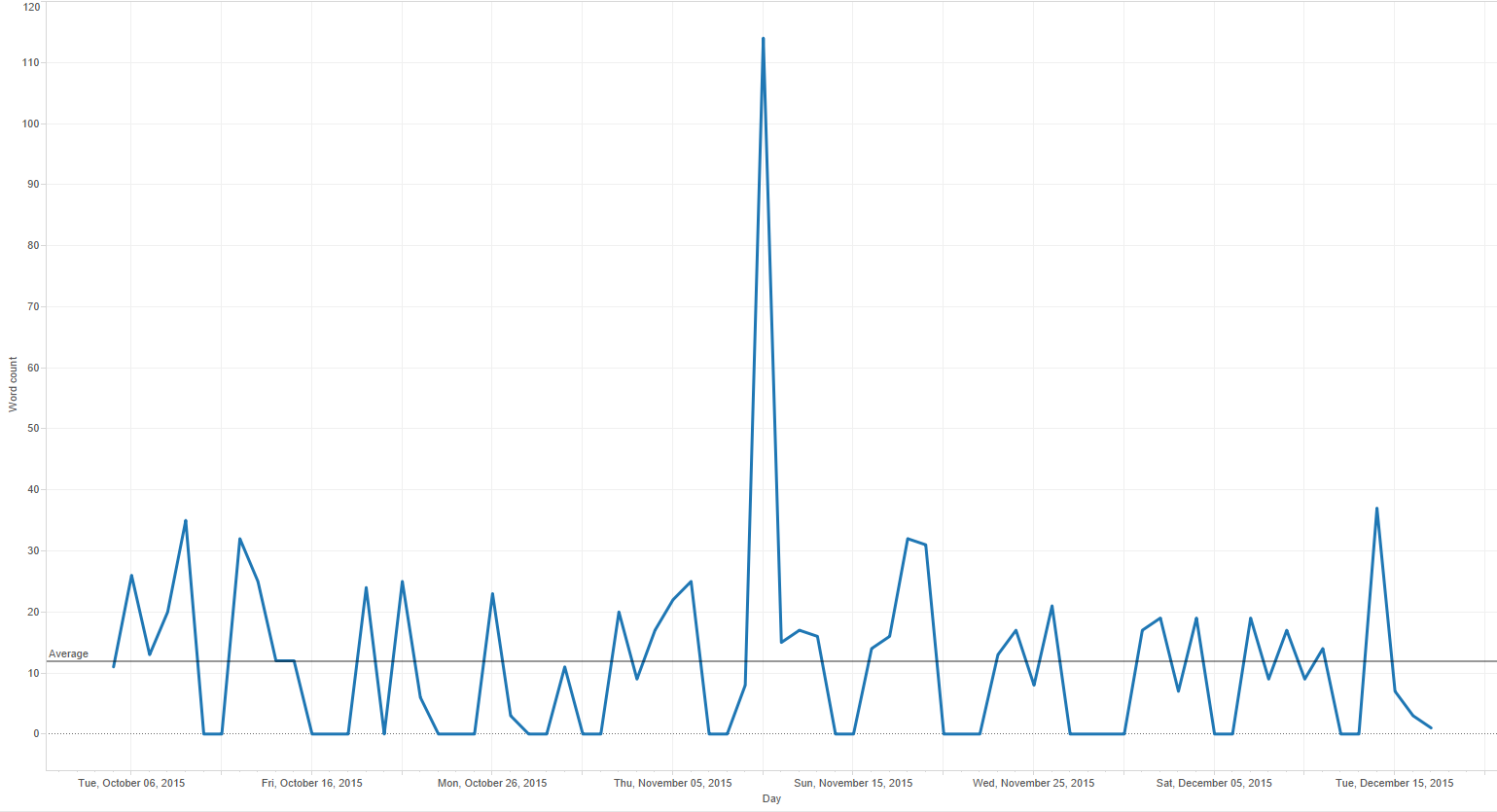
- Day by Day
- Daily count: the total number of utterances of the “Word” on that specific date. Also contains a short note detailing what went on that day.
- Notable features[1]
- The displayed average count is close to 12 per day. This is not entirely correct since weekends (counted as 0) are included. The actual average per days when data was actually collected is 18.6 (as seen in the Weekday (Average) chart, discussed further down). Excluding these weekend/not-in zeroes in Tableau has proven quite difficult, but an interesting exercise all the same.
- The spike in the data, while clearly an outlier, is not that much of an outlier. Sadly, this could not be proven during the data collection period. In this circumstance, you’ll have to trust me that they happen frequently.
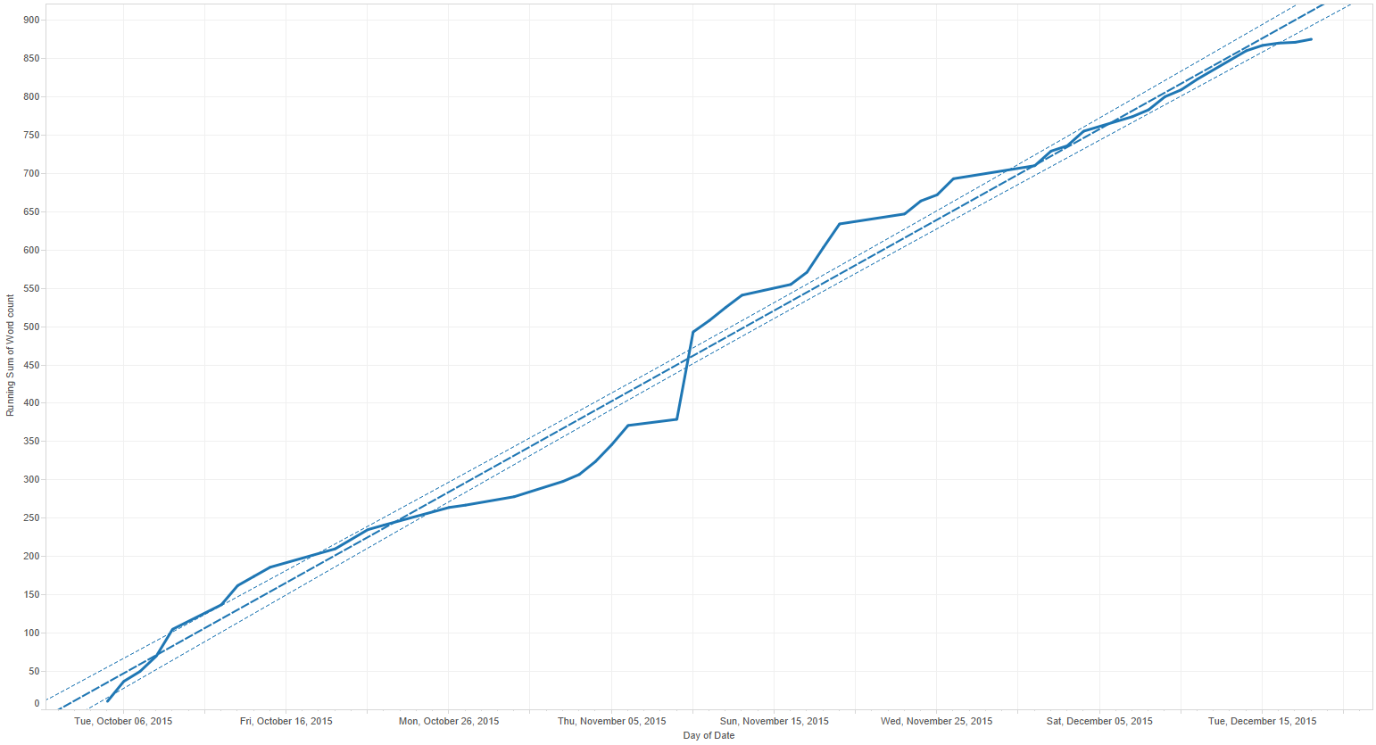
- Running total / Moving average
- The running total shows the steady pace of utterances of the “Word.” The moving average is comparing the specific day’s count with the average of the last five, creating a very rough five-day (i.e., work week) average.
- Notable features:
- The running total contains few discrepancies in daily additions based on the overall trend line average.
- The moving average shows that the sudden spike that one fateful Tuesday in November was preceded by a two-week lull. It was then followed by another lull, essentially lasting until the end of the data collection.
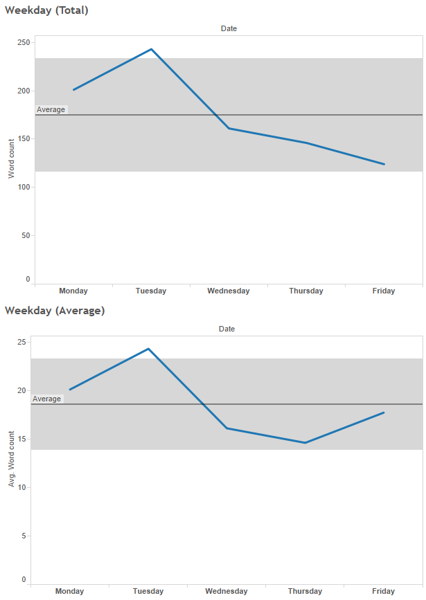
- Weekday (Total and Average)
- The last two charts shows the total and average based on what day of the week it was.
- Notable features:
- The beginning of the week was more prone to “Word” utterances than the latter part. This pretty much follows the formula norm in the office during a normal work week, where it is usually front-loaded with meetings with decreasing rate of activities as the weekend draws nearer.
- The Tuesday spike is somewhat skewed by the previously mentioned November outlier, so perhaps the Monday “Word” count average of 20 (1.5x more than the average) is more indicative as an above-average average.
- The Friday average is higher, but also has three less days of data received as an average, due to either co-worker or the Data Collector being out of office.
Conclusion
The process proved to be both fun and tedious at the same time and in the end it was a rewarding little side project. It proved the general estimation that the “Word” was uttered almost twice more per day than initially thought (18.6 to 10). It was also rewarding to tinker with self-collected data in Tableau, rather than trawling the Web for anything interesting to present.
The Word is still heavily used in the office.
[1] Another co-worker refers to bugs in tools and applications as features, so the notable feature listings in this blog involves both data highlights and Tableau ‘features’ I couldn’t get to work as I intended.
0 Comments